Project Details
- Website redesign for The Historic Dockyard Chatham
- Client project with Hatched London
- March – May 2022 (3 Months)
The Team
- My Role: UX/UI Designer.
- Team: 2 UX/UI Designers, 1 Developer, 1 Project Manager & 1 Design Director.
Tools
- XD
- Asana
- Miro
Problem Overview
At the heart of the Historic Dockyard Chatham Trust’s (CHDT) quest for digital transformation lies a multifaceted challenge stemming from the need to bridge the gap between its rich historical legacy and its digital representation. While the current website served as a gateway to the dockyard’s offerings, its outdated infrastructure and cumbersome navigation impeded CHDT’s ability to effectively engage with its diverse audience and communicate its mission and offerings.
Outcomes
- Successful redesign and launch of The Historic Dockyard Museum website.
- Successful design and launch of Master Ropemakers Makers ecommerce site.
- Enhanced website accessibility.
- Positive feedback received from the CHDT team.
*Pending acquisition of key performance indicators (KPIs) for the website redesign.
Problem
What is The Historic Dockyard Chatham?
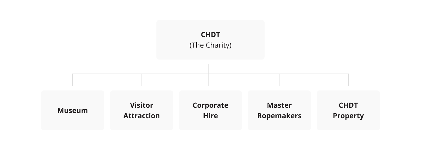
The Chatham Historic Dockyard Trust (CHDT) is an independent charitable organization devoted to safeguarding and showcasing The Historic Dockyard Chatham’s maritime legacy. Founded on principles of preservation and promotion, CHDT has evolved its operational structure since the inception of its website.
Common problems/observations from website from their internal team
The site’s layout and elements do not adjust effectively and responsively to different screen sizes and devices.
Navigation is inefficient and not user-friendly.
The design appears outdated and lacks modern functionality.
The website lacks support for international shipping.
Push for a deeper understanding
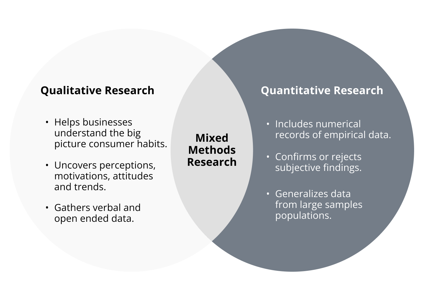
I recommended user interviews, heat mapping, and behavioural analytics to gather qualitative and quantitative insights so we could falsify or validate the observations from their internal team. Due to time, resource, and budget constraints, we pursued a heuristic evaluation instead.
Heuristic Evaluation
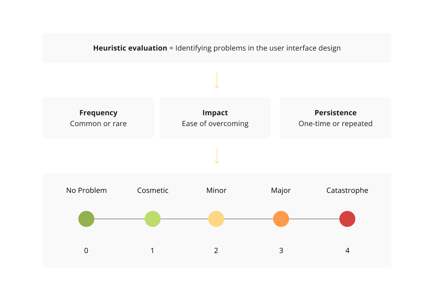
To conduct the heuristic evaluation, we examined the website based on a set of usability principles. Then, we considered frequency, impact, and persistence and ranked them based on severity.
1. Navigation
Make it effortlessly easy and efficient for users to move around the site.

Violations
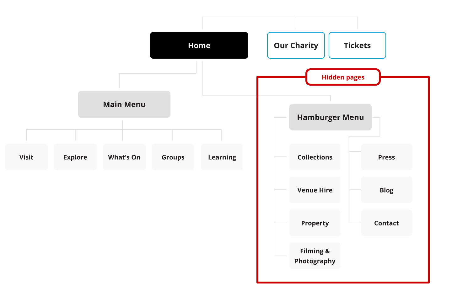
- Having two menus on the desktop version of the site is really confusing.
- The pages in the hambuger menu become more hidden because of this.
- The pages and sections could be organised more efficiently.
Why is this important?
- Hidden navigation reduces discoverability and usability compared to visible or partially visible navigation.
- Users tend to engage with hidden navigation later in tasks, impacting overall user experience.
- Both mobile and desktop interfaces suffer in terms of user experience metrics such as task difficulty assessment, time spent, and task success rates due to hidden navigation.
2. Accessibility
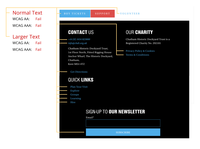
We found some severe accessibility issues with the site.

Violations
- Colour contrast needs improvement on primary buttons, text links, and navigation elements.
- Images, buttons, and links lack descriptive text.
- Lack of focusable content affects navigation.
- Restricted page zoom limits accessibility.
- Overuse of italics can hinder readability.
- Line height falls below the minimum value.
- Form fields lack clear labels for user input.
Why is this important?
- Enhancing color contrast ensures that users with visual impairments can easily discern important elements, improving overall readability and usability.
- Providing descriptive text for images, buttons, and links enables users who rely on screen readers to understand content and navigate effectively.
- Implementing clear labels for form fields enhances user understanding and interaction, particularly for individuals with cognitive disabilities or those using assistive technologies.
3. Inconsistent and confusing design system.
The website’s design and development approach resulted in content being incorrectly uploaded, leading to confusion among site visitors.

Violations
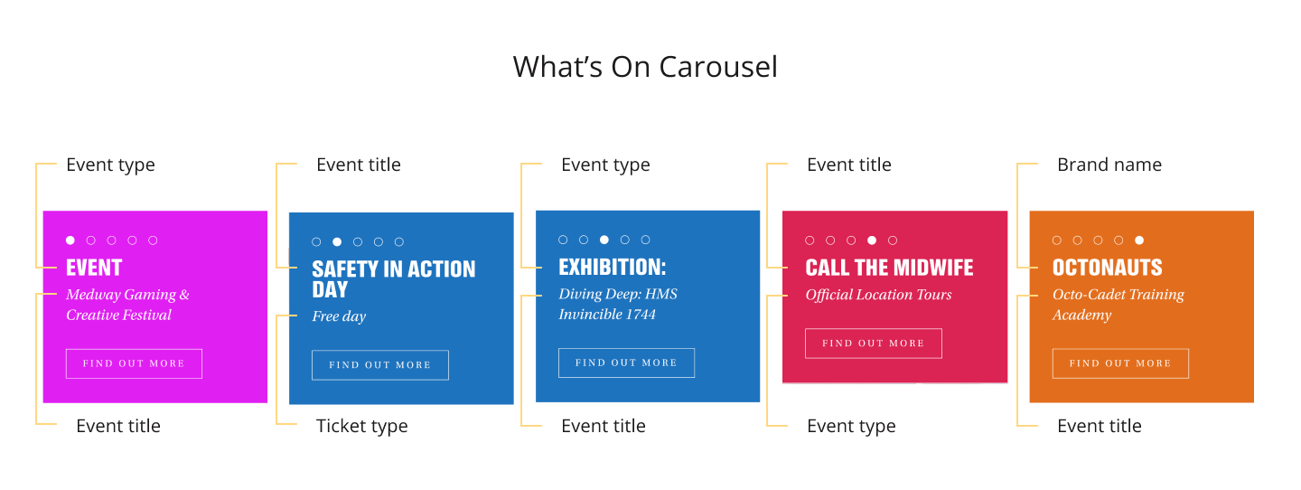
- The inconsistent use of colors and lack of clear organization for carousel blocks diminish the user experience, making it challenging for users to quickly identify and understand showcased events.
- Inconsistent module design on the Chatham Dockyard website confuses users, increases cognitive load, disrupts navigation, and erodes trust.
Why is this important?
- Consistent design and organization enhance user understanding and streamline navigation, fostering a positive user experience.
- Cohesive design elements reduce cognitive load and frustration, promoting user trust and engagement with the website.
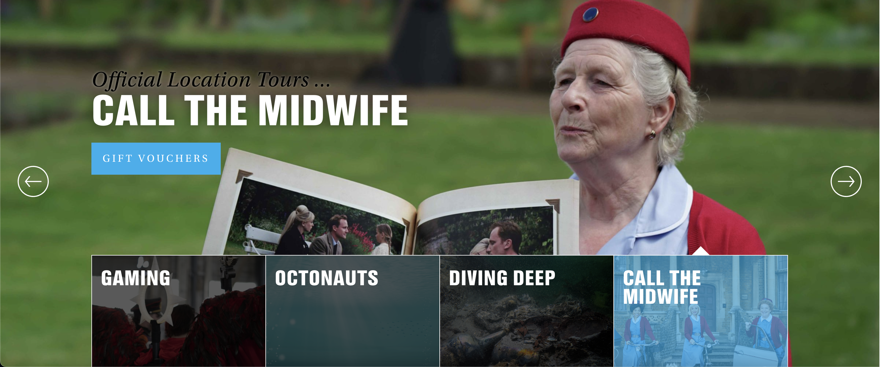
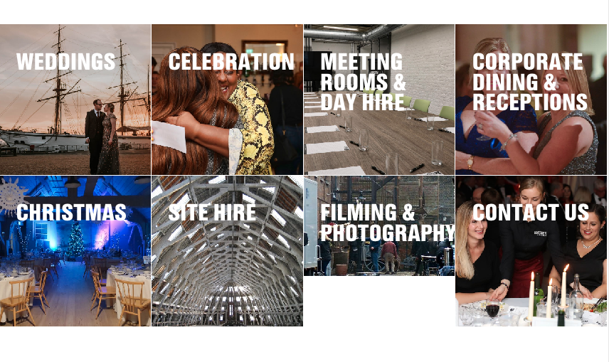
4. Overuse of imagery.
Excessive imagery on the site overwhelms users, hindering comprehension and potentially deterring customers.

Violations
- The excessive use of imagery throughout the site overwhelms users, causing cognitive overload and potentially repelling prospective customers.
- Insufficient utilization of white space contributes to visual clutter, further exacerbating cognitive strain.
- The necessity to upload extensive imagery sometimes results in content that doesn’t align well with the format or is of low quality.
Why is this important?
- Striking a balance between imagery and white space enhances user comprehension and engagement, fostering a more pleasant browsing experience.
- Ensuring high-quality and contextually relevant imagery improves user perception of the site’s professionalism and credibility.
- Managing imagery effectively can positively impact user retention rates and conversion metrics by preventing information overload and maintaining visual appeal.
5. Unclear or non-communicative sections or pages.
Modules or pages that don’t reallty reflect


Violations
- The original modules on the Historic Dockyard Chatham’s homepage failed to effectively communicate and promote its diverse offerings. Generic calls-to-action and minimal content did not adequately represent the breadth of services and attractions available, leaving visitors uninformed and disengaged.
Why is this important?
- Clear and informative components facilitate user understanding of available services and attractions, encouraging user engagement and exploration.
- Effective communication of offerings can lead to increased user interest, satisfaction, and potentially higher conversion rates.
- Ensuring that calls-to-action are specific and compelling improves user navigation and encourages desired interactions, contributing to a positive user experience.
Solution
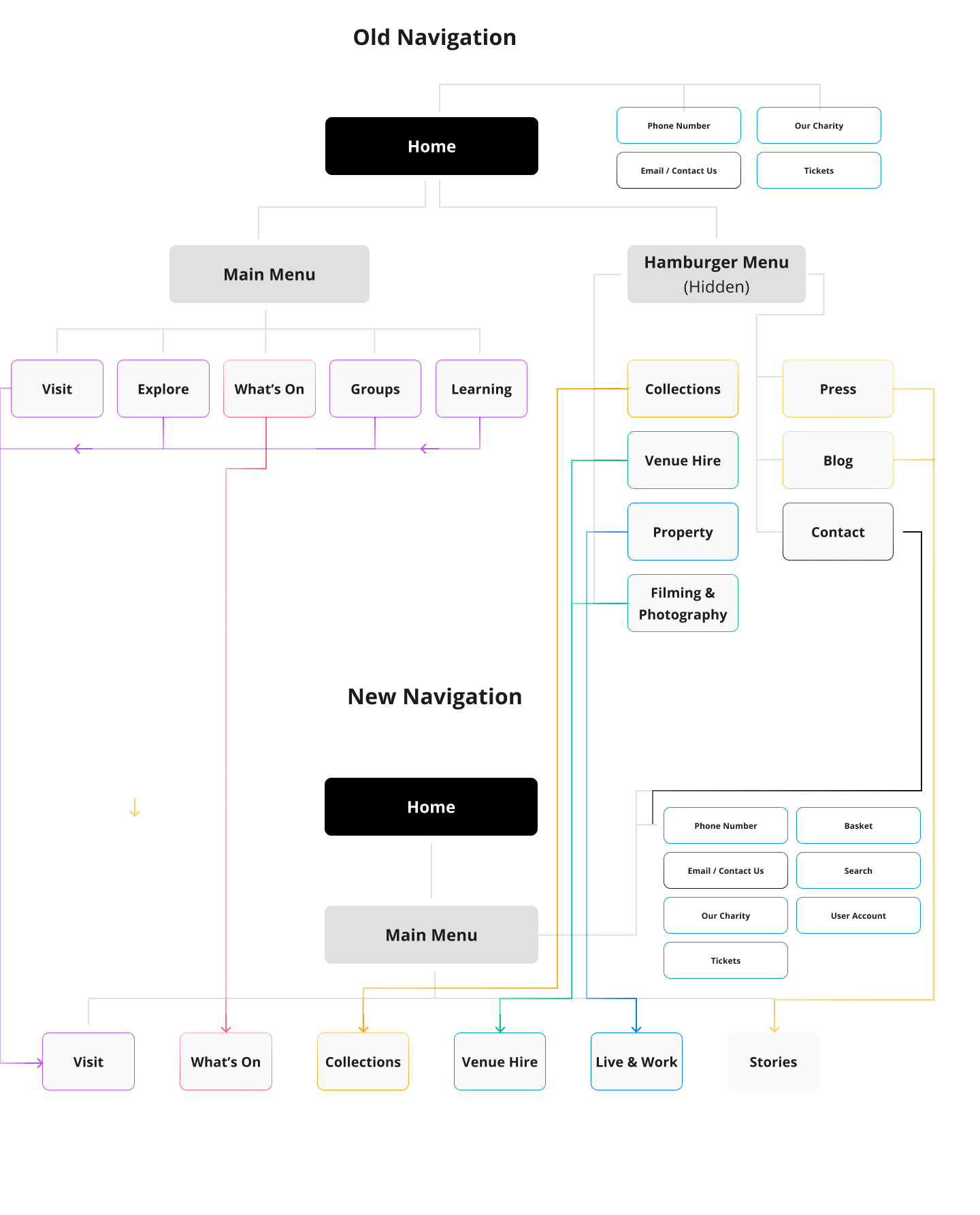
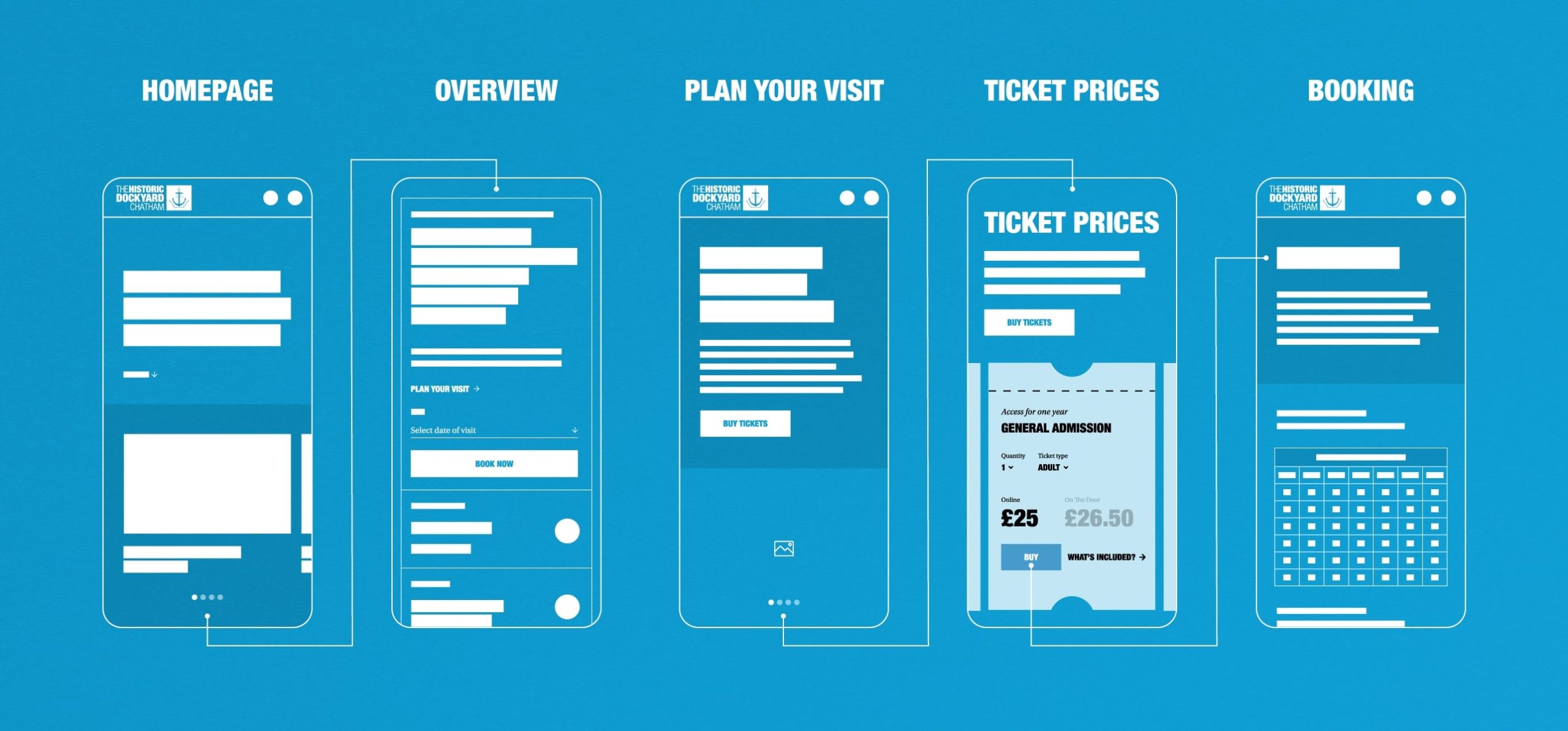
Update to the navigation & sitemap
Reorganized the navigation to prioritize key sections and improve discoverability.
Implemented a clear and intuitive sitemap to streamline user journeys and reduce cognitive load.
Promotional Modules and Page Enhancement
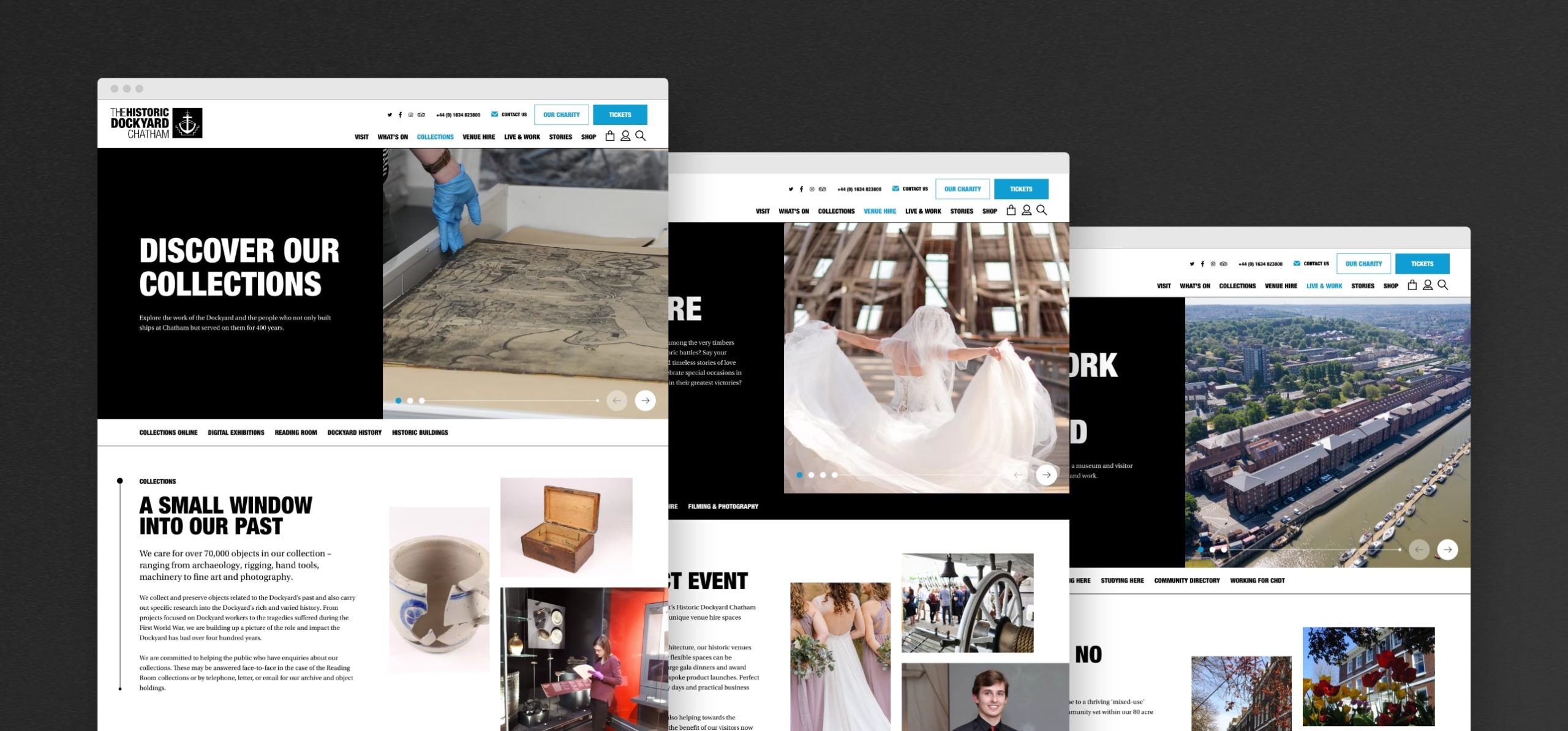
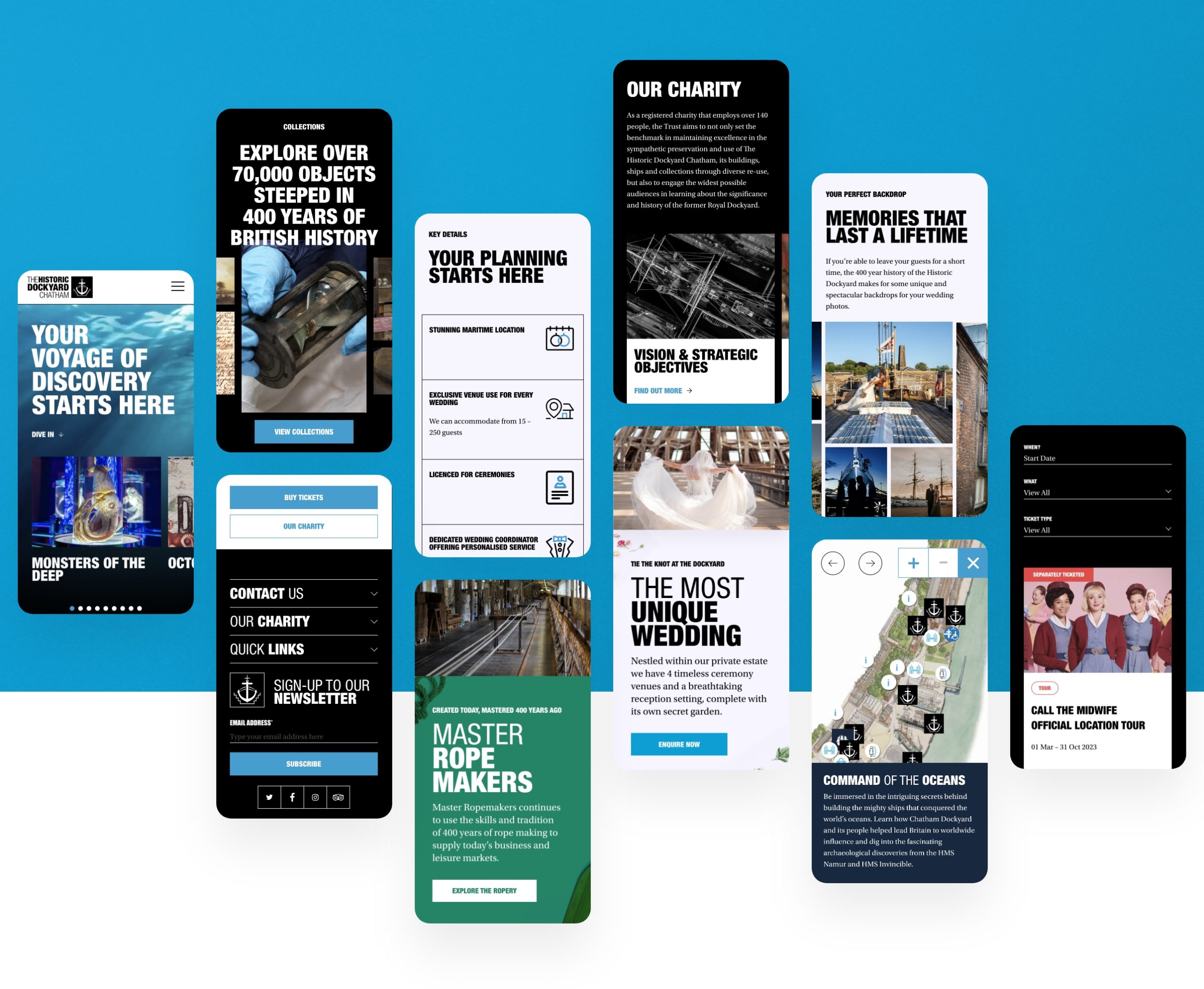
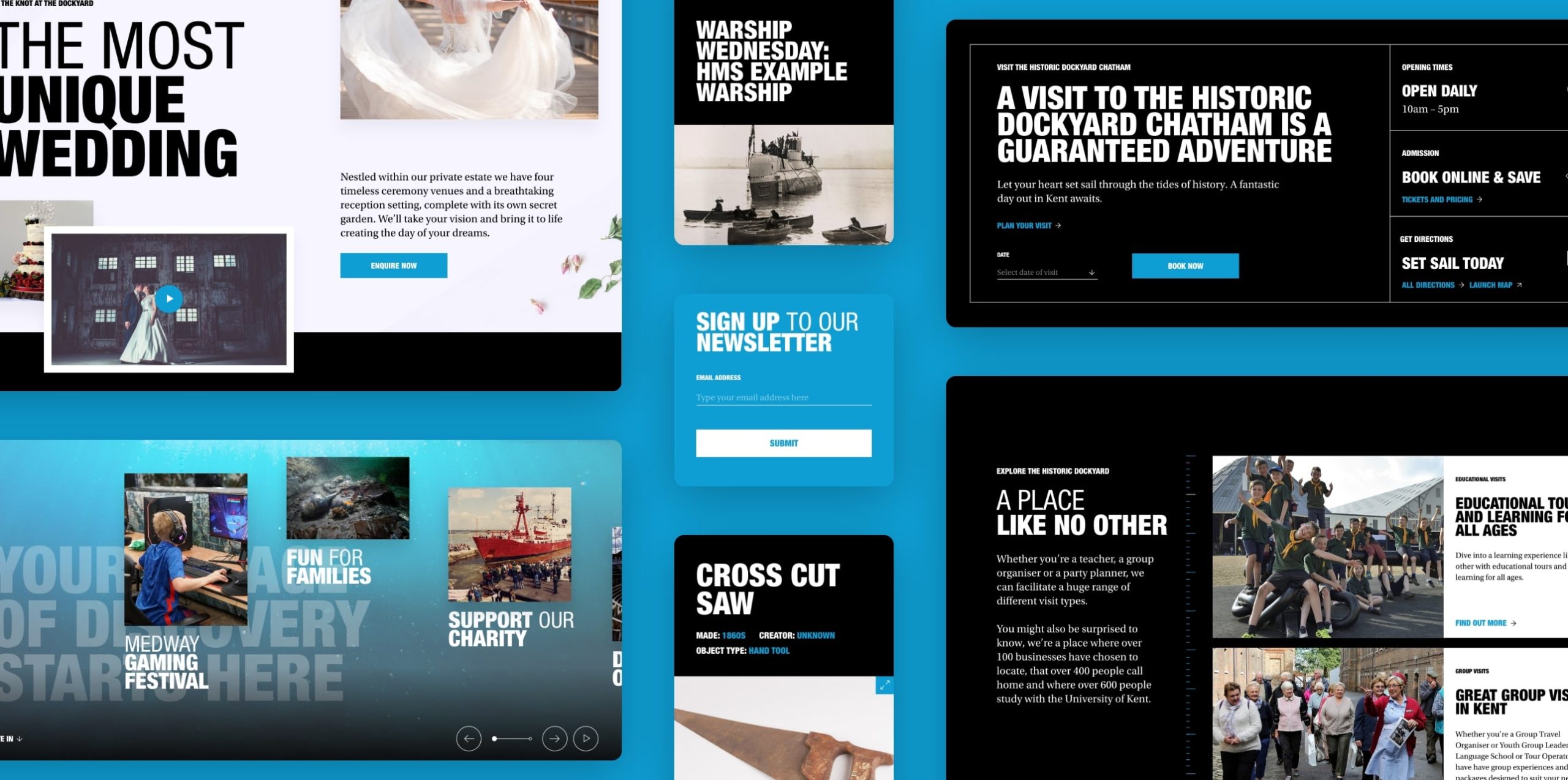
Redesigned promotional modules to create a visually engaging and interactive experience.
Introduced dynamic content blocks to highlight events, news, and attractions, increasing user engagement.
Visual Design Overhaul
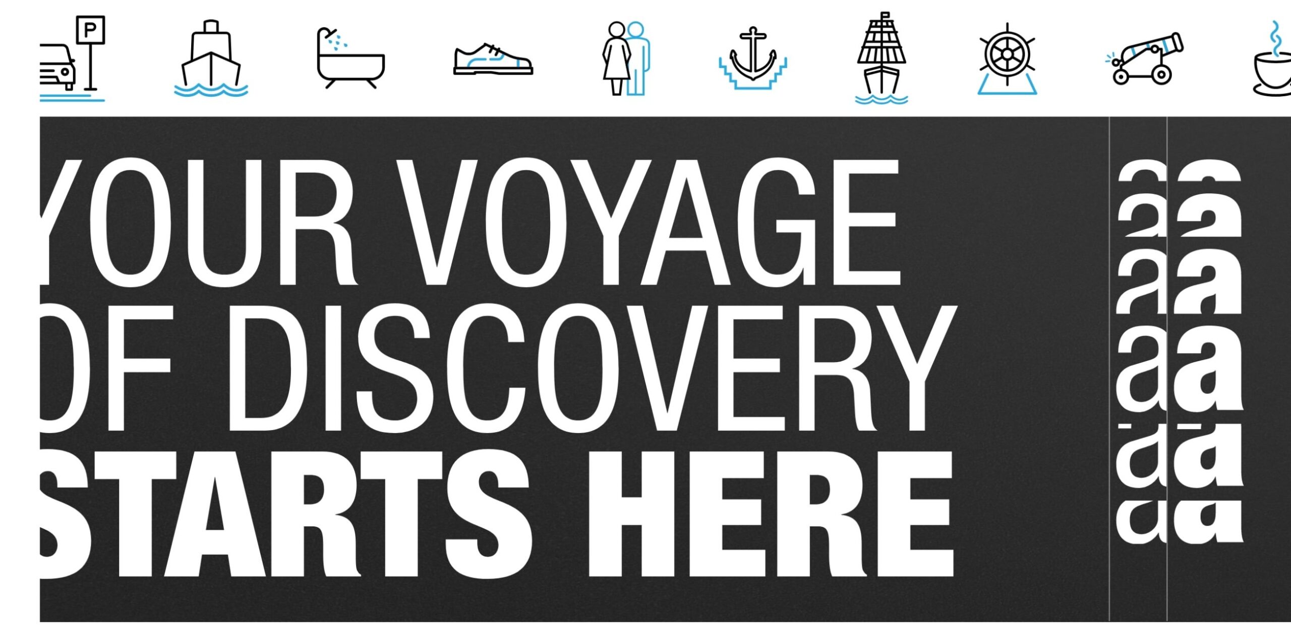
Optimized color schemes, typography, and imagery to enhance readability and visual appeal across devices.
Implemented a modern and cohesive design system to improve brand consistency and user experience.
Accessibility Improvements
Enhanced accessibility features, including improved color contrast, descriptive text for images and buttons, and clear focus indicators.
Ensured compliance with accessibility standards to cater to diverse user needs and improve inclusivity.
Content Optimisation
Streamlined content presentation by reducing clutter and enhancing white space for improved readability.
Optimized imagery usage and loading times to minimize cognitive overload and enhance page performance.

Clear Communication Components
Implemented compelling calls-to-action and informative content blocks to guide users through the website and encourage exploration.
Redesigned homepage modules to effectively communicate the breadth of services and attractions offered by the Historic Dockyard Chatham.
Outcomes
Successful redesign and launch of The Historic Dockyard Museum website.
Implemented a modern and intuitive user interface, enhancing the overall user experience and navigation.
Integrated interactive features such as virtual tours and multimedia content, enriching visitor engagement and promoting the museum’s offerings effectively.
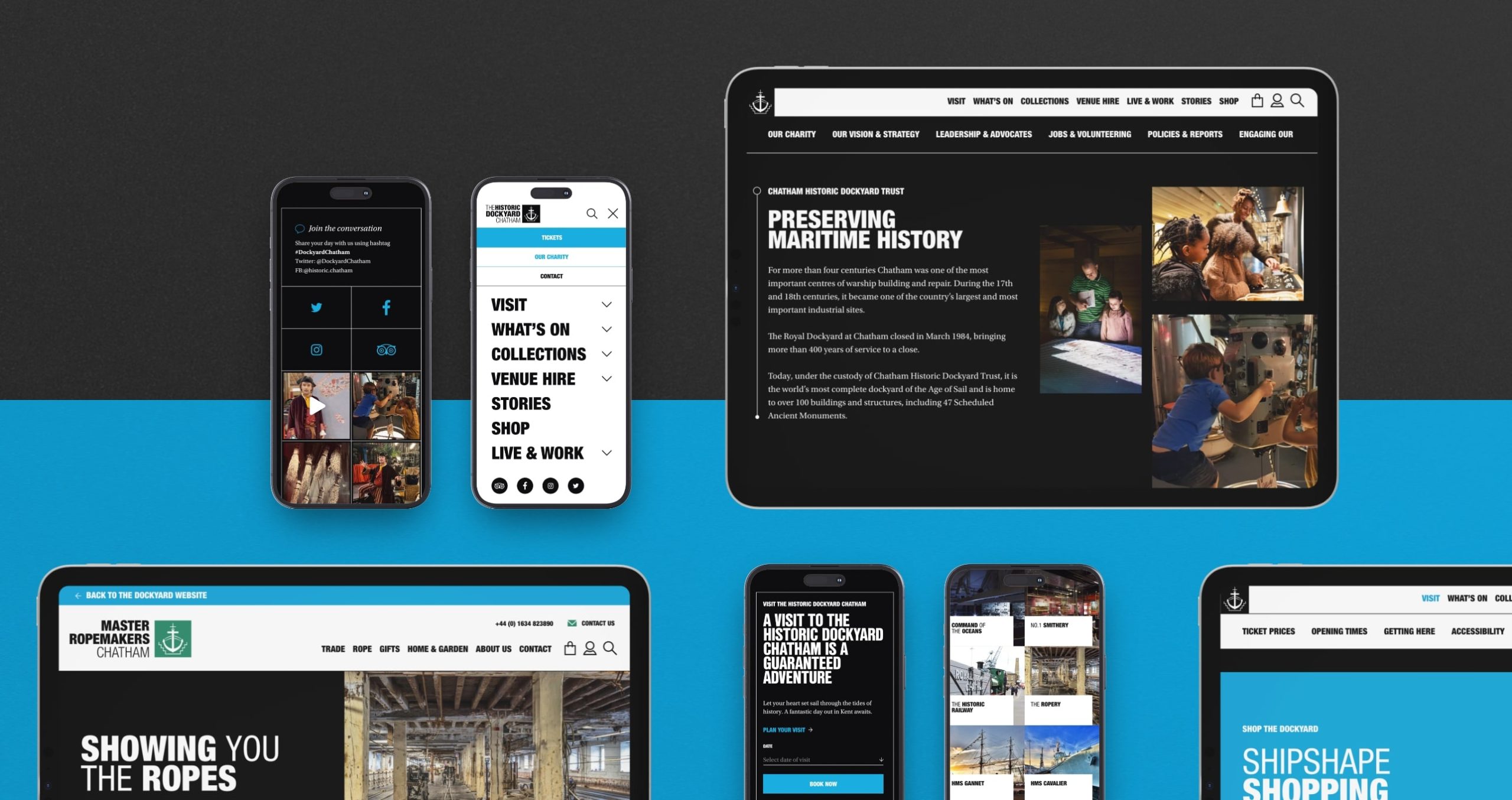
Successful design and launch of the Master Ropemakers Chatham ecommerce site.
Launched a user-friendly e-commerce platform for Ropemakers, seamlessly integrating online and onsite sales while offering a smooth booking experience for visitors.
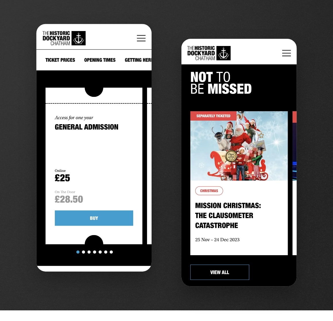
Enhanced website accessibility.
Implemented accessibility features such as alt text for images and keyboard navigation to ensure inclusivity for all users.
Conducted thorough testing and adherence to WCAG guidelines to enhance website accessibility, resulting in improved usability for individuals with disabilities.
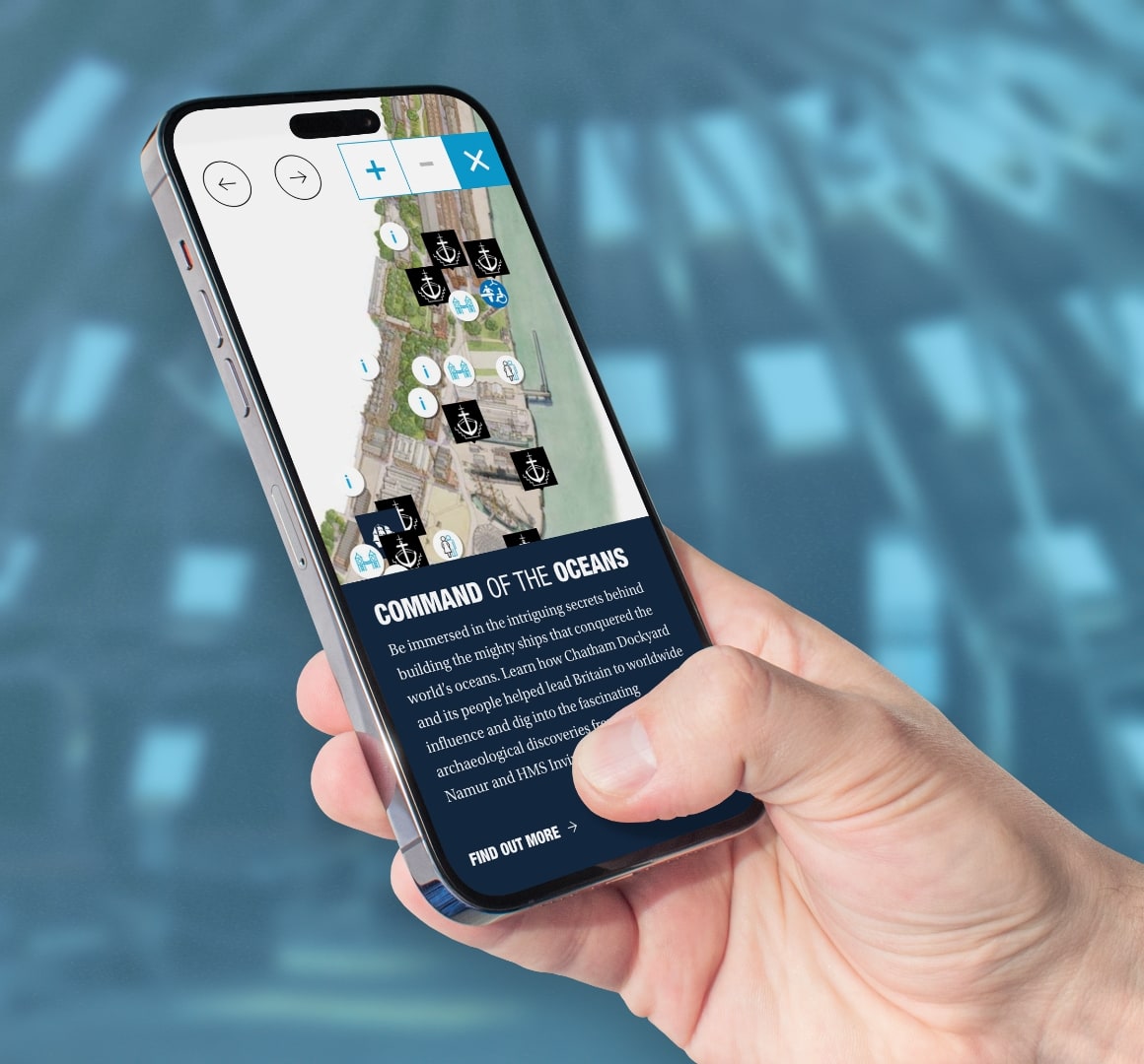
Positive feedback received from the CHDT team.
Received commendations from the CHDT team for the redesigned website’s user-friendly interface and improved functionality, indicating successful collaboration and achievement of project goals.
- CHDT team expressed satisfaction with the website redesign, citing its effectiveness in showcasing museum offerings and meeting objectives.
Learnings
Keep it human-centred. Always.
Even when redesigning a website, it is important to start by empathizing with the user. This allows us to think about effective solutions compared to conducting an evaluation as a checklist.
Emphasize cost-effective and efficient research methods.
Post-project, I investigated budget-friendly research avenues such as Microsoft Clarity and prototype testing with a small group of real customers. Prioritizing these methods can enhance website redesign outcomes, even with constrained resources.
Consistent Branding
When working with a client, it is important to present the redesign in a way that fits with their branding.

